Team
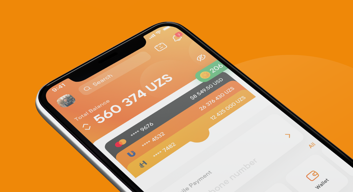
On the project, I started working in a team with which we developed the product from scratch in accordance with the requirements. After the release, I moved to the position of lead designer and continued to support the product, taking part in the development of new products.
Activities
Designing wireframes and mockups, conducting user testing, collaborating with development team, continuously monitoring and improving the overall user experience of the product and design.
Results
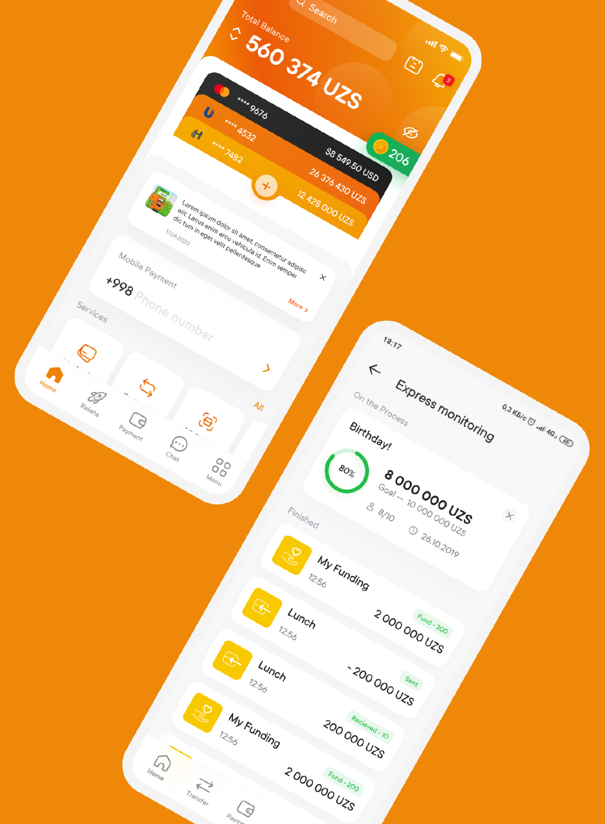
My main achievement, and a source of great pride for me, is the product itself. It has achieved significant popularity in Central Asia, standing out for its exceptional user-friendliness compared to other similar applications in the region. The product serves as a prime example of a well-executed approach to developing a new and successful product.
Wireframes
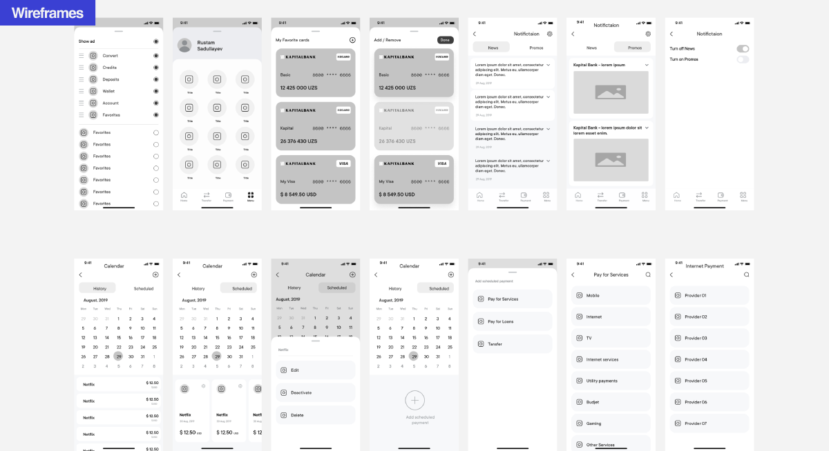
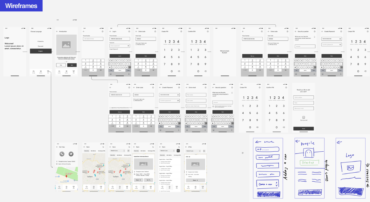
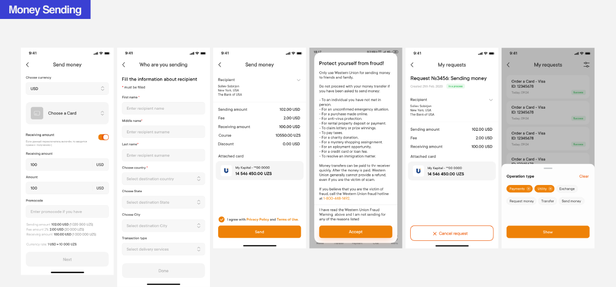
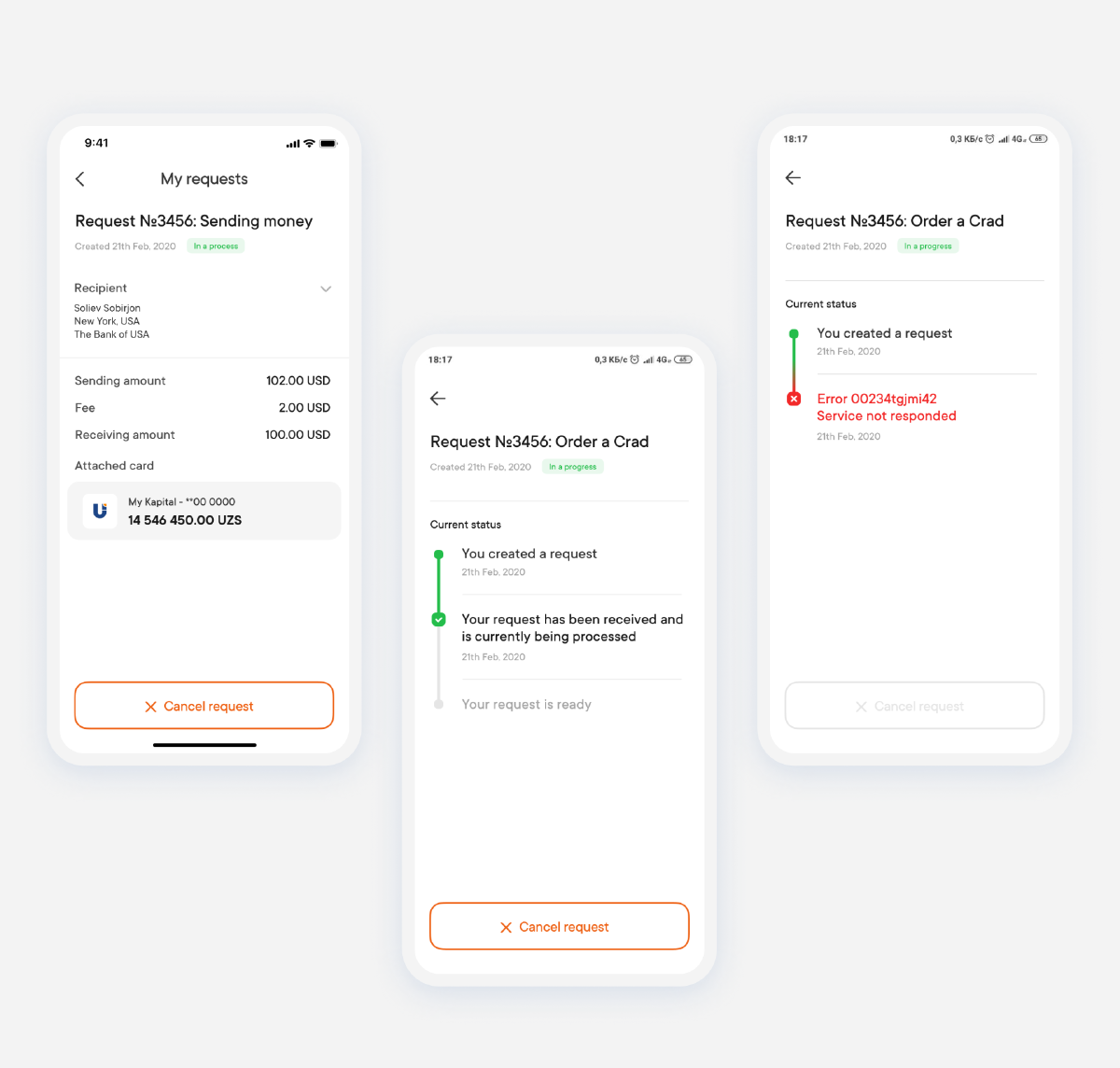
To validate the insights collected from user interviews, I constructed a low-fidelity clickable prototype using Figma. This prototype was then tested with diverse users. The testing phase identified several issues, prompting redesigns of the screens to address these concerns effectively.
Design system in 2 months
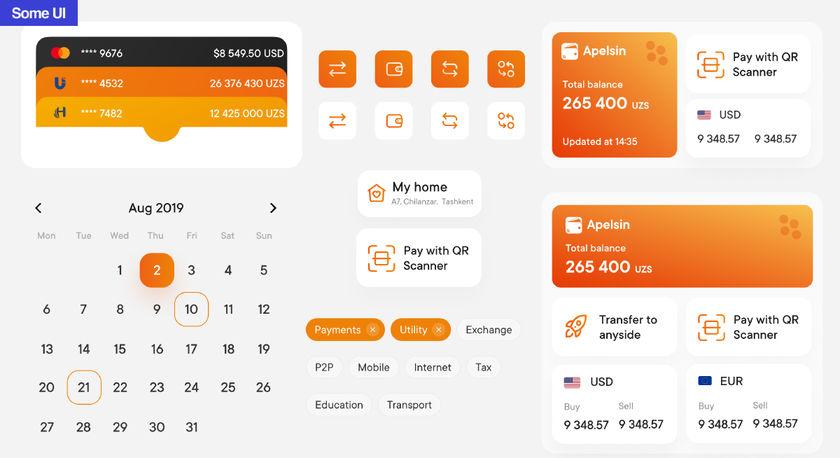
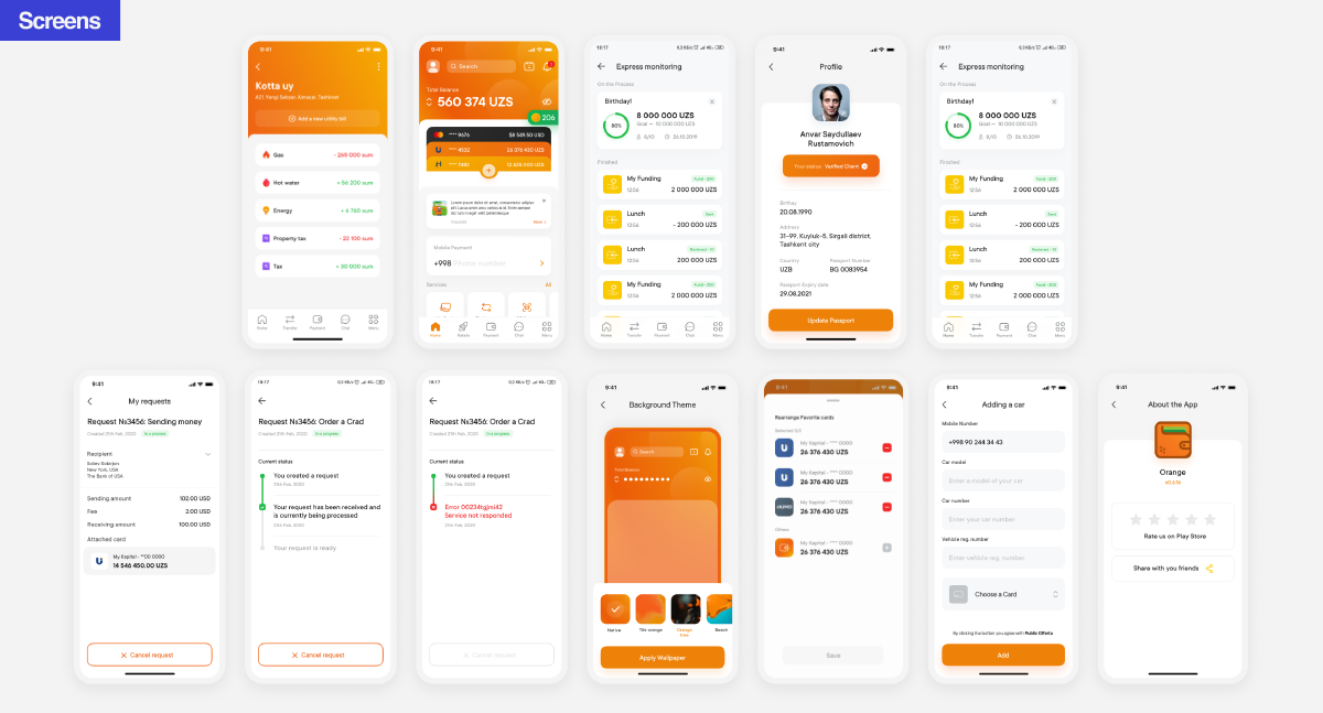
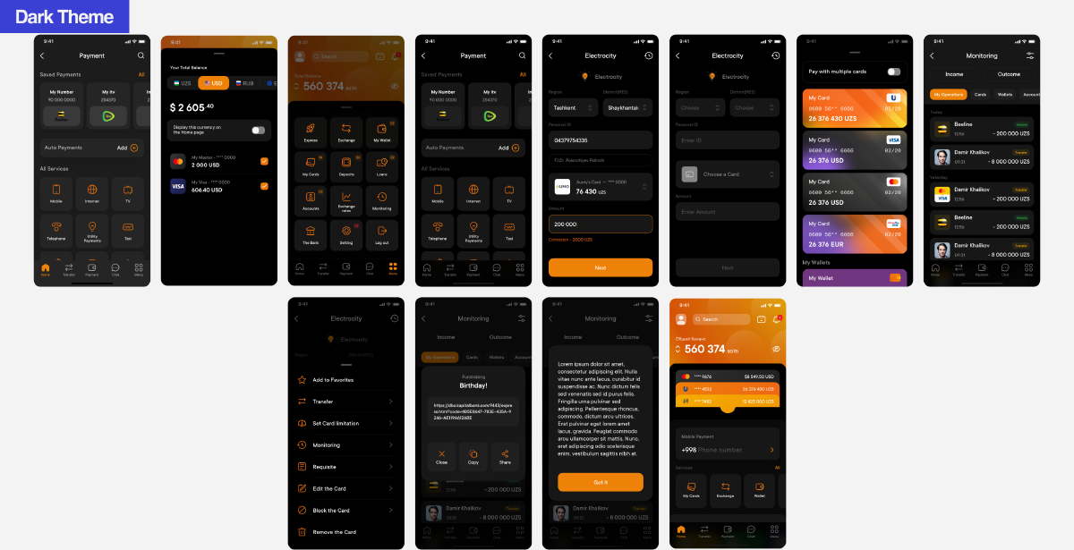
As the senior designer on the team, my primary responsibility revolved around creating a comprehensive UI Kit and component library. This task played a pivotal role in our project, and I played a major role in its successful execution. Over a period of two months, we accomplished the remarkable feat of creating and finalizing a comprehensive library comprising 4,000 elements. This library catered to the needs of various platforms, including the mobile application, marketplace, and web transition projects. The completion and approval of this extensive component library marked a significant milestone in our overall design efforts.
User testing
When faced with a tight time frame, finding the right type of user testing becomes crucial, especially for fintech applications that require quick user orientation amidst a plethora of functionalities. To address this challenge, we opted for 5-second tests during the testing phase of wireframes and prototypes. This approach allowed users to perform specific actions within a limited timeframe, providing valuable insights into their quick comprehension and navigation of the application’s functionalities.


